Chart Vizzard
Vizzlo's AI-based chart generator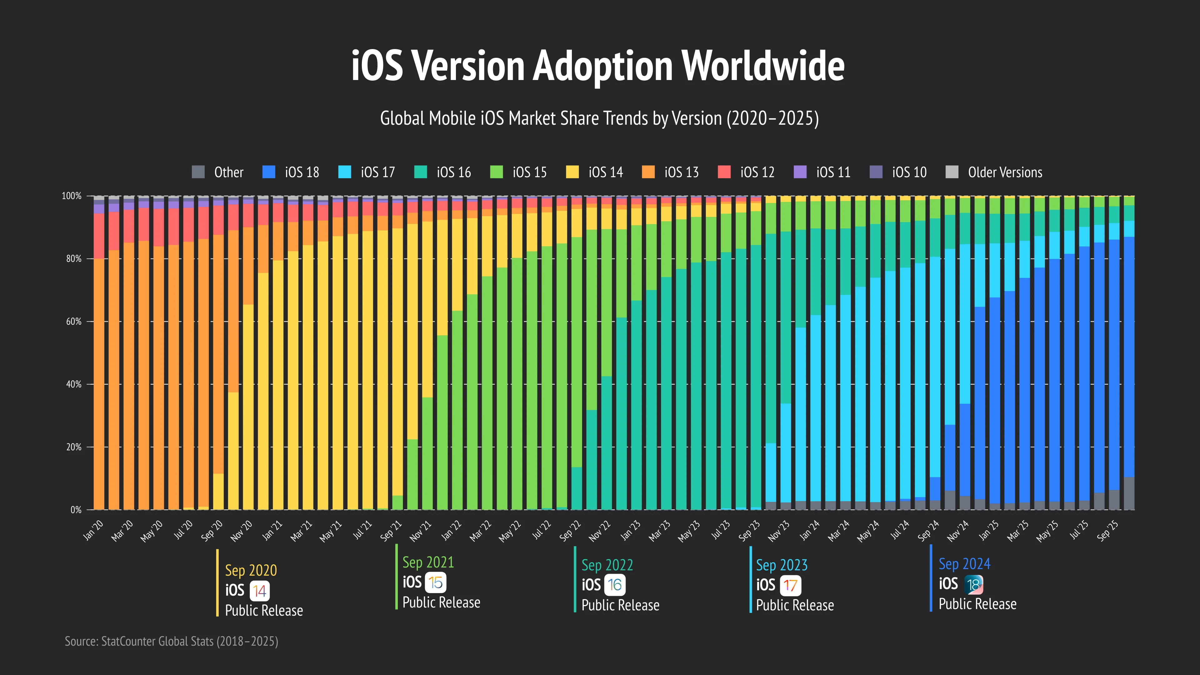
iOS Version Adoption Worldwide
This stacked bar chart visualizes the global adoption of Apple iOS versions between 2020 and 2025, showing how each major iOS release gradually replaced older versions over time. The visualization highlights the annual transition cycle of the Apple ecosystem, where newly released iOS versions rapidly gained market share following their public release each September.
The chart clearly demonstrates the accelerating adoption of newer iOS versions, particularly iOS 17 and iOS 18, while older versions steadily declined and eventually became negligible within the global iPhone user base. The visualization also emphasizes Apple’s strong software update ecosystem, with recent iOS versions reaching dominant market share within months after launch.
Using color-coded stacked bars, release annotations, and a dark Apple-inspired design, the chart makes it easy to track long-term iOS adoption trends, compare the lifecycle of different iOS generations, and understand how quickly users migrate to the latest Apple software versions worldwide.
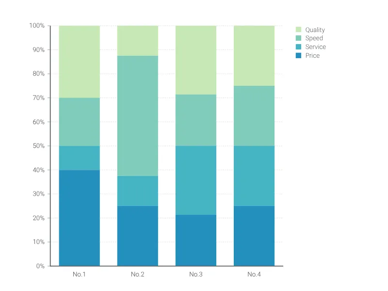
This is an example of Vizzlo's “100% Stacked Bar Chart”
Create a stacked bar chart that adds up to 100%.